Note
Visualization of trajectories#
If we work with trajectory data, we often want to visualize them from a so called birds eye view. The following example demonstrates how to achieve this with tasi using the DLR Urban Traffic Dataset.
Load trajectories#
At first, let’s load trajectories from the DLR dataset.
[1]:
from tasi.dlr import DLRUTDatasetManager, DLRUTVersion, DLRTrajectoryDataset
dataset = DLRUTDatasetManager(DLRUTVersion.latest)
# select a trajectory file from the middle of the dataset to include data from all object classes
ut = DLRTrajectoryDataset.from_csv(dataset.trajectory()[48])
ut
[1]:
| acceleration | center | classifications | dimension | interpolated | velocity | yaw | ||||||||||||||
|---|---|---|---|---|---|---|---|---|---|---|---|---|---|---|---|---|---|---|---|---|
| easting | magnitude | northing | easting | northing | bicycle | car | motorbike | pedestrian | truck | van | height | length | width | easting | magnitude | northing | ||||
| timestamp | id | |||||||||||||||||||
| 2023-09-24 12:00:00.016482+00:00 | 1695556712692966 | 0.003 | 0.010 | 0.009 | 604755.977 | 5792823.363 | 0.025 | 0.824 | 0.150 | 0.000 | 0.000 | 0.000 | 1.625 | 2.407 | 1.334 | False | 0.004 | 0.020 | 0.019 | -73.593 |
| 1695556715491157 | -1.093 | 1.235 | -0.575 | 604795.259 | 5792804.167 | 0.000 | 0.883 | 0.109 | 0.005 | 0.003 | 0.000 | 1.556 | 3.463 | 2.045 | False | -3.971 | 4.113 | -1.074 | -164.869 | |
| 1695556722944961 | -0.000 | 0.001 | 0.001 | 604753.090 | 5792830.880 | 0.000 | 0.579 | 0.334 | 0.000 | 0.087 | 0.000 | 1.682 | 2.135 | 1.124 | False | -0.000 | 0.008 | -0.008 | -69.165 | |
| 1695556743992329 | -0.005 | 0.007 | 0.006 | 604751.898 | 5792835.737 | 0.000 | 0.590 | 0.060 | 0.000 | 0.344 | 0.000 | 1.990 | 2.508 | 1.565 | False | -0.012 | 0.016 | 0.010 | -68.221 | |
| 1695556773745982 | 0.013 | 0.021 | 0.016 | 604793.176 | 5792766.007 | 0.002 | 0.811 | 0.176 | 0.011 | 0.000 | 0.000 | 1.366 | 2.739 | 1.101 | False | 0.014 | 0.026 | -0.022 | 110.513 | |
| ... | ... | ... | ... | ... | ... | ... | ... | ... | ... | ... | ... | ... | ... | ... | ... | ... | ... | ... | ... | ... |
| 2023-09-24 12:14:59.966482+00:00 | 1695557695944822 | -0.626 | 0.632 | -0.085 | 604725.113 | 5792777.272 | 0.008 | 0.925 | 0.056 | 0.000 | 0.011 | 0.000 | 1.450 | 2.909 | 1.466 | True | 10.926 | 11.018 | 1.419 | 7.340 |
| 1695557698396270 | 0.127 | 0.327 | -0.301 | 604798.425 | 5792719.248 | 0.000 | 0.989 | 0.003 | 0.006 | 0.001 | 0.000 | 1.472 | 3.275 | 1.686 | False | -4.345 | 13.879 | 13.181 | 108.258 | |
| 1695557698694887 | 0.149 | 0.161 | 0.061 | 604810.204 | 5792821.677 | 1.000 | 0.000 | 0.000 | 0.000 | 0.000 | 0.000 | 1.656 | 0.909 | 0.497 | False | -4.130 | 4.296 | -1.184 | -163.998 | |
| 1695557699646115 | -0.706 | 0.709 | 0.068 | 604685.307 | 5792776.662 | 0.000 | 0.996 | 0.000 | 0.000 | 0.000 | 0.004 | 1.637 | 3.301 | 1.654 | False | 11.289 | 11.297 | 0.410 | 2.078 | |
| 1695557700093347 | -1.155 | 1.187 | -0.274 | 604652.341 | 5792771.867 | 0.000 | 0.692 | 0.308 | 0.000 | 0.000 | 0.000 | 1.306 | 3.873 | 1.524 | True | 12.743 | 12.759 | -0.639 | -2.968 | |
299053 rows × 19 columns
Plot trajectories#
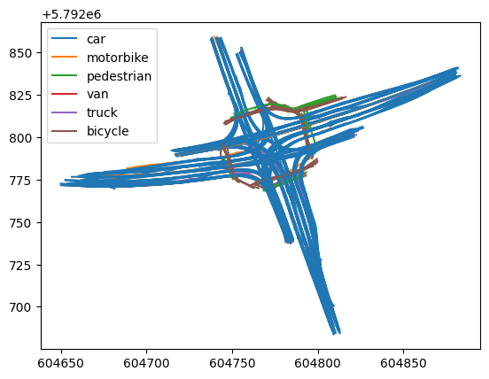
We now utilize the TrajectoryPlotter to visualize the trajectories of the traffic participants that we’ve loaded.
[2]:
from tasi.plotting import TrajectoryPlotter
import matplotlib.pyplot as plt
f, ax = plt.subplots()
plotter = TrajectoryPlotter()
plotter.plot(ut, ax=ax)
Change trajectory color#
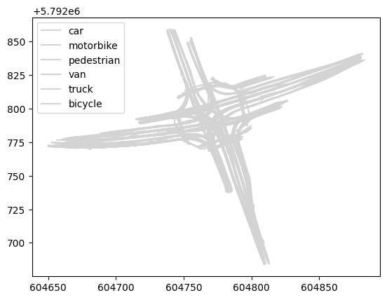
Note that the trajectories are colorized with the default color which we can change so any arbitrary color, such as lightgray.
[3]:
f, ax = plt.subplots()
plotter.plot(ut, ax=ax, color="lightgray")
Change color of a specific trajectory#
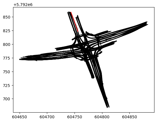
You can also define the color of a specific trajectory.
[4]:
f, ax = plt.subplots()
plotter.plot(
ut, ax=ax, color="black", trajectory_kwargs={ut.ids[-20]: {"color": "red"}}
)
Change trajectory opacity#
or even change the opacity of each trajectory to quickly get an overview of the traffic density. Let’s change the opacity to 20% via the alpha argument.
[5]:
f, ax = plt.subplots()
plotter.plot(ut, ax=ax, alpha=0.2)
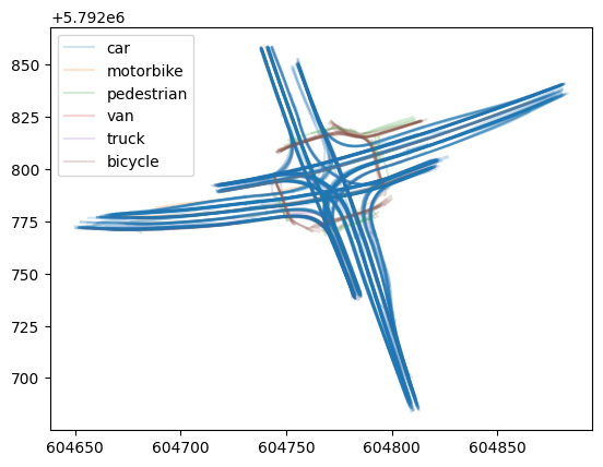
The plot already indicates the various traffic volumes on the different routes at the intersection.
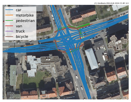
Plot DLR UT trajectories on orthophoto#
We can also combine the TrajectoryPlotter with the BoundingboxPlotter to visualize trajectories on an orthophoto.
[6]:
import numpy as np
from tasi.plotting import BoundingboxPlotter, LowerSaxonyOrthophotoTile
f, ax = plt.subplots()
# plot the orthophoto first
bbox_plotter = BoundingboxPlotter(ut.roi, LowerSaxonyOrthophotoTile())
bbox_plotter.plot(ax)
# and the trajectories on top
tj_plotter = TrajectoryPlotter()
tj_plotter.plot(ut, ax=ax)
# hide the axis
_ = ax.axis("off")
[2025-04-25 12:19:22 | tiles.py:fetch:184] > INFO: Requesting https://opendata.lgln.niedersachsen.de/doorman/noauth/dop_wms?bbox=604649,5792683,604883,5792859&service=WMS&crs=EPSG%3A25832&format=image%2Fpng&request=GetMap&layers=ni_dop20&styles=&version=1.3.0&width=512&height=385
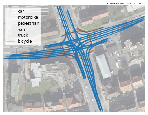
Note that it may become hard to see the trajectories on the background. To increase the contrast, we can adapt the opacity of the ortophoto via the alpha argument. Let’s set is to 0.5 (50%) to highlight the trajectories.
[7]:
f, ax = plt.subplots()
bbox_plotter.plot(ax, alpha=0.5)
tj_plotter.plot(ut, ax=ax, alpha=0.25)
_ = ax.axis("off")
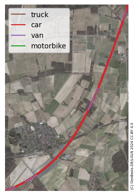
Plot DLR HT trajectories on orthophoto#
We can also use the TrajectoryPlotter with the BoundingboxPlotter to visualize trajectories of the DLR HT dataset on an orthophoto. Let’s load and plot the trajectories from the DLR HT dataset. This time, let’s use the DLRTrajectoryPlotter to color the trajectories in default DLR-colors.
[8]:
from tasi.dlr.dataset import DLRHTDatasetManager, DLRHTVersion
from tasi.dlr.plotting import DLRTrajectoryPlotter
# load dataset
dataset = DLRHTDatasetManager(DLRHTVersion.latest)
path = dataset.load()
# use 3 as it contains objects from all object classes
ht = DLRTrajectoryDataset.from_csv(dataset.trajectory()[3])
f, ax = plt.subplots()
# plot the orthophoto first
bbox_plotter = BoundingboxPlotter(ht.roi, LowerSaxonyOrthophotoTile())
bbox_plotter.plot(ax)
# and the trajectories on top
tj_plotter = DLRTrajectoryPlotter()
tj_plotter.plot(ht, ax=ax)
# hide the axis
_ = ax.axis("off")
[2025-04-25 12:19:27 | dataset.py:load:130] > INFO: Checking if dataset already downloaded /tmp/DLR-Highway-Traffic-dataset_v1-1-0
[2025-04-25 12:19:27 | dataset.py:load:166] > INFO: Dataset already available at /tmp/DLR-Highway-Traffic-dataset_v1-1-0
[2025-04-25 12:19:29 | tiles.py:fetch:184] > INFO: Requesting https://opendata.lgln.niedersachsen.de/doorman/noauth/dop_wms?bbox=614174,5791044,617606,5796205&service=WMS&crs=EPSG%3A25832&format=image%2Fpng&request=GetMap&layers=ni_dop20&styles=&version=1.3.0&width=512&height=769
Visualizing geospatial trajectories#
The tasi model for representing trajectory data using geospatial objects opens the world to utilize tools that support geopandas. For instance, if you want an interactive view on trajectory data, we can utilize folium via geopandas. For this purpose, we need two conversion steps.
At first, we need to convert the dataset to a native tasi representation.
[9]:
ds = ut.to_tasi()
ds.head()
[9]:
| position | velocity | acceleration | heading | yaw_rate | ... | boundingbox | ||||||||||||||||
|---|---|---|---|---|---|---|---|---|---|---|---|---|---|---|---|---|---|---|---|---|---|---|
| easting | northing | easting | magnitude | northing | easting | magnitude | northing | ... | front | front_right | right | rear_right | rear | |||||||||
| ... | easting | northing | easting | northing | easting | northing | easting | northing | easting | northing | ||||||||||||
| timestamp | id | |||||||||||||||||||||
| 2023-09-24 12:00:00.016482+00:00 | 1695556712692966 | 604755.977 | 5792823.363 | 0.004 | 0.020 | 0.019 | 0.003 | 0.010 | 0.009 | -73.593 | NaN | ... | 604756.316939 | 5.792822e+06 | 604755.677100 | 5.792822e+06 | 604755.337161 | 5.792823e+06 | 604754.997222 | 5.792824e+06 | 604755.637061 | 5.792825e+06 |
| 1695556715491157 | 604795.259 | 5792804.167 | -3.971 | 4.113 | -1.074 | -1.093 | 1.235 | -0.575 | -164.869 | -inf | ... | 604793.587528 | 5.792804e+06 | 604793.320628 | 5.792805e+06 | 604794.992100 | 5.792805e+06 | 604796.663572 | 5.792806e+06 | 604796.930472 | 5.792805e+06 | |
| 1695556722944961 | 604753.090 | 5792830.880 | -0.000 | 0.008 | -0.008 | -0.000 | 0.001 | 0.001 | -69.165 | inf | ... | 604753.469686 | 5.792830e+06 | 604752.944436 | 5.792830e+06 | 604752.564750 | 5.792831e+06 | 604752.185064 | 5.792832e+06 | 604752.710314 | 5.792832e+06 | |
| 1695556743992329 | 604751.898 | 5792835.737 | -0.012 | 0.016 | 0.010 | -0.005 | 0.007 | 0.006 | -68.221 | inf | ... | 604752.363268 | 5.792835e+06 | 604751.636622 | 5.792834e+06 | 604751.171353 | 5.792835e+06 | 604750.706085 | 5.792837e+06 | 604751.432732 | 5.792837e+06 | |
| 1695556773745982 | 604793.176 | 5792766.007 | 0.014 | 0.026 | -0.022 | 0.013 | 0.021 | 0.016 | 110.513 | inf | ... | 604792.696100 | 5.792767e+06 | 604793.211694 | 5.792767e+06 | 604793.691594 | 5.792766e+06 | 604794.171494 | 5.792765e+06 | 604793.655900 | 5.792765e+06 | |
5 rows × 35 columns
Note that the boundingbox attribute was added in this step. Since ds is a tasi.TrajectoryDataset it also uses pandas. Hence, we will now convert to use geopandas while the position attribute should be encoded as a GeoObject.
[10]:
gds = ds.as_geopandas("position")
We need to set the position attribute as the active geometry.
[11]:
gds.set_geometry("position", inplace=True)
Now, we are ready to visualize the trajectories in a dynamic window, while we use the “CartoDB positron” background layer for reference.
[12]:
gds.explore(crs="EPSG:32632", tiles="CartoDB positron")
[12]:
Note that for each traffic participant (or trajectory), additional information is available when hovering over its representation in the map. You can customize the representaton of the trajectories and add or remove attributes to you liking.